And so ends the ABC Challenge. I am terribly sad to see this challenge over. I almost want to start all over again because there are so many letters that I had multiple nail art ideas for. Take Z for example. There's zebras, zombies, and zigzags and the one I went with:
Z is for ... Zippers
I did this design completely backwards. I was working on swatching Shimmer Polish (swatches coming next week) when I was hit with the idea of zippers opening up to reveal Mary in all it's glittery glory.
I think it turned out pretty great considering I had to draw everything around that small V of Mary you see. To learn how to do a traditional zipper nail and not my backwards version you should definitely check out this picture tutorial found on Beautylish.
Will any of you be joining me for the Inspired by Time Periods Challenge??
Showing posts with label ABC Challenge. Show all posts
Thursday, March 7, 2013
Wednesday, March 6, 2013
Y is for ...
I am so sad to see the ABC Challenge end. Especially since I am running behind. Still, I'm looking forward to the start of the new nail art challenge: Inspired by Time Periods. This challenge will be hosted in the same group as the ABC Challenge so don't think you're in the wrong place when you click the link! Still, until then, I have Y and Z left to do. Thankfully, this post takes care of Y.
Y is for ... Cracked Eggs and Dripping Yolk.
I really wanted to finish this challenge the way I started ... by doing the unusual and being different. So I went with yolk.
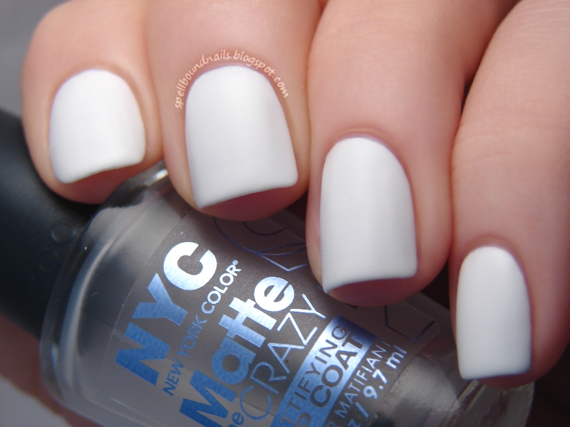
I started with two coats of L.A. Colors Energy Source and put a coat of NYC Matte Me Crazy over it to give it a very awesome smoothly matte look. I think this alone would be a totally wearable look!
Still, we all know eggs aren't really smooth. They're kind of speckled and dimpled if you look close enough. So I took a piece of makeup sponge and dabbed on a bit more white. I know! So much different from my usual eyeshadow applicator.
After that, I drew on the egg yolk drips with Sally Hansen Lightening and outlined them with a mix of Lightening and Sally Hansen Sun Kissed. I kinda wish I had added a bit of fake light reflection with this mixture too, but I really like the finished look. To make the yolk really shiny and keep the matte look of the egg I actually used a nail art brush to put Seche Vite on just the drips.
Y is for ... Cracked Eggs and Dripping Yolk.
I really wanted to finish this challenge the way I started ... by doing the unusual and being different. So I went with yolk.
I started with two coats of L.A. Colors Energy Source and put a coat of NYC Matte Me Crazy over it to give it a very awesome smoothly matte look. I think this alone would be a totally wearable look!
Still, we all know eggs aren't really smooth. They're kind of speckled and dimpled if you look close enough. So I took a piece of makeup sponge and dabbed on a bit more white. I know! So much different from my usual eyeshadow applicator.
After that, I drew on the egg yolk drips with Sally Hansen Lightening and outlined them with a mix of Lightening and Sally Hansen Sun Kissed. I kinda wish I had added a bit of fake light reflection with this mixture too, but I really like the finished look. To make the yolk really shiny and keep the matte look of the egg I actually used a nail art brush to put Seche Vite on just the drips.
Monday, March 4, 2013
X is for ...
I'm back!! My new computer arrived Saturday, and I spent the weekend getting it set up. The actual setup was easy and took minutes, but the little details of everyday use are a bit harder. You don't realize all the little things (like font, text size, saved passwords, desktop icons) about your computer you take for granted until they look almost right but are just wrong enough to really bug you. I'm still working on getting those little things fixed, but it feels so great to be back!! :)
Being back means I have some nail art to catch up on — like ABC Challenge posts. The challenge is coming to an end this Wednesday, and I still haven't posted my X mani.
X is for ... X-Men.
The uniforms were weird enough to catch my eye; bright yellow and black create an interesting contrast. I'm oddly reminded of Bumblebee from Transformers. The First Class uniforms have an odd black circle around the bellybutton area that has a yellow X cut straight through that I replaced on the chest area (or at least what I imagine is the chest area) with simple black letters to spell XMEN.
The hosts of the ABC Challenge have decided to start a new challenge once this one is over. It will be Inspired by Time Periods so be sure to check out the group if you'd like to join. It will certainly be challenging! :)
Also, what do you guys think of the new St. Patrick's Day layout? I went to change the header and buttons to something more festive like always and everything went wonky! I had to rearrange and recode almost everything. I think it looks much better though, neater and more organized ... at least for me. How's it look for everyone else? No overflow or anything weird like that?
Being back means I have some nail art to catch up on — like ABC Challenge posts. The challenge is coming to an end this Wednesday, and I still haven't posted my X mani.
X is for ... X-Men.
I knew immediately I wanted to use X-Men for X. I just wasn't exactly sure what kind of design I wanted to do for X-Men. I went searching and found the X-Men: First Class comics ... and the uniforms.
The uniforms were weird enough to catch my eye; bright yellow and black create an interesting contrast. I'm oddly reminded of Bumblebee from Transformers. The First Class uniforms have an odd black circle around the bellybutton area that has a yellow X cut straight through that I replaced on the chest area (or at least what I imagine is the chest area) with simple black letters to spell XMEN.
The hosts of the ABC Challenge have decided to start a new challenge once this one is over. It will be Inspired by Time Periods so be sure to check out the group if you'd like to join. It will certainly be challenging! :)
Also, what do you guys think of the new St. Patrick's Day layout? I went to change the header and buttons to something more festive like always and everything went wonky! I had to rearrange and recode almost everything. I think it looks much better though, neater and more organized ... at least for me. How's it look for everyone else? No overflow or anything weird like that?
Wednesday, February 13, 2013
W is for ...
Hello everyone and welcome to another ABC Challenge post! This week we're up to the letter W. Coming up with words to use for each letter and then creating a nail art design for that word is harder than it sounds! My mind goes blank every week, so I usually scroll through dictionary sites to find my word of the week. I thought there was absolutely nothing to do this week that I could then link to Valentine's Day, but I finally came up with something. And it has no pink!!
W is for ... Wings of Love.
I have wanted to do a caged bird mani forever! And I completely and totally adore how this one turned out!! I started with 3 coats of LA Colors Energy Source. More coats than I usually use, but since so much of the white was going to show I didn't want any chance of this being sheer or patchy. The black is Petites Night. I tried to keep everything connected between nails. The open birdcage, the cursive love, and the bird all leading to the heart.
I love this mani so much that I couldn't seem to stop taking pictures. I tried to choose one from every angle so you can get the full effect.
I actually sacrificed an old nail art brush to do this mani. I couldn't get the lines small and delicate enough for the birdcage and the cursive love with the brushes I have, so I cut some bristles off an old brush to make it thinner! A great use for old brushes and cheaper than buying a thinner brush!!
It looks intricate and elegant, but is actually pretty simple when you break it down by nail. I found the hardest part is actually the birdcage, at least for me. Don't try to twist your hand around to do it right-side-up — this will just make your hands shaky and it's harder/messier to do an 'n' shape with nail polish; it's so much easier to leave your hand pointed straight away from you and just create a U on your nail. Create a smaller U inside that making sure the bottom of your u's touch/overlap and put a line down the middle. Add a line across the bottom, a handle at the top, and an open door on the side.
I really hope you enjoy this mani as much as I do. Check back tomorrow for the last Valentine's Day mani.
W is for ... Wings of Love.
I have wanted to do a caged bird mani forever! And I completely and totally adore how this one turned out!! I started with 3 coats of LA Colors Energy Source. More coats than I usually use, but since so much of the white was going to show I didn't want any chance of this being sheer or patchy. The black is Petites Night. I tried to keep everything connected between nails. The open birdcage, the cursive love, and the bird all leading to the heart.
I love this mani so much that I couldn't seem to stop taking pictures. I tried to choose one from every angle so you can get the full effect.
I actually sacrificed an old nail art brush to do this mani. I couldn't get the lines small and delicate enough for the birdcage and the cursive love with the brushes I have, so I cut some bristles off an old brush to make it thinner! A great use for old brushes and cheaper than buying a thinner brush!!
It looks intricate and elegant, but is actually pretty simple when you break it down by nail. I found the hardest part is actually the birdcage, at least for me. Don't try to twist your hand around to do it right-side-up — this will just make your hands shaky and it's harder/messier to do an 'n' shape with nail polish; it's so much easier to leave your hand pointed straight away from you and just create a U on your nail. Create a smaller U inside that making sure the bottom of your u's touch/overlap and put a line down the middle. Add a line across the bottom, a handle at the top, and an open door on the side.
I really hope you enjoy this mani as much as I do. Check back tomorrow for the last Valentine's Day mani.
Wednesday, February 6, 2013
V is for ...
Is it Wednesday already?? This week is going way too fast! Still, it is Wednesday and you know what that means: ABC Challenge nail art. Can you believe we're up to the letter V already?
V is for ... Vampire's Valentine.
I loved last year's Anti-Valentine's Day nails so much that I decided to use it as inspiration for this mani. Honestly, I really can't believe how far I've come in a year.
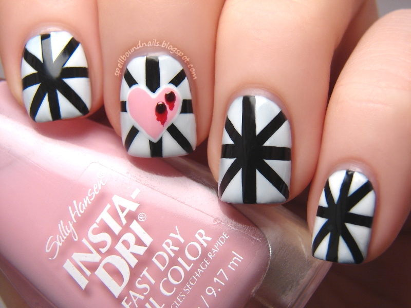
I loved the entire design of this mani, every step taken to create them, so I took many pictures! A base of black, some tape, and some white polish created this star-burst design.
I used white polish to create a heart on my index nail. The white creates a barrier over the black; this means you don't need to use a ton of pink to cover the black. It also creates a very pretty border around your pink heart if you make it slightly smaller than your white heart. This alone would make for a gorgeous Valentine's Day mani!! You could even create hearts on all your nails instead of just as an accent or use red for the heart to make it really stand out.
Since I was going to create bleeding fang marks on my heart I knew I couldn't use red. :) The bleeding marks add depth and give these nails a nearly 3-D look—all a pretty illusion of course. With the dark fang marks, the bright red blood, and the white outline, doesn't it look like the heart is really bleeding?
Finally, I created white outlined blood on the tips of my nails. I added a small amount of Venique Runway Sparkle over all of the blood. Sadly, I couldn't seem to get a good picture with the actual sparkle.
So, which are you this Valentine's Day: hearts and roses or vampire bites? Will you be rolling out the Anti-Valentine's Day red carpet?
V is for ... Vampire's Valentine.
I loved last year's Anti-Valentine's Day nails so much that I decided to use it as inspiration for this mani. Honestly, I really can't believe how far I've come in a year.
I loved the entire design of this mani, every step taken to create them, so I took many pictures! A base of black, some tape, and some white polish created this star-burst design.
I used white polish to create a heart on my index nail. The white creates a barrier over the black; this means you don't need to use a ton of pink to cover the black. It also creates a very pretty border around your pink heart if you make it slightly smaller than your white heart. This alone would make for a gorgeous Valentine's Day mani!! You could even create hearts on all your nails instead of just as an accent or use red for the heart to make it really stand out.
Since I was going to create bleeding fang marks on my heart I knew I couldn't use red. :) The bleeding marks add depth and give these nails a nearly 3-D look—all a pretty illusion of course. With the dark fang marks, the bright red blood, and the white outline, doesn't it look like the heart is really bleeding?
Finally, I created white outlined blood on the tips of my nails. I added a small amount of Venique Runway Sparkle over all of the blood. Sadly, I couldn't seem to get a good picture with the actual sparkle.
So, which are you this Valentine's Day: hearts and roses or vampire bites? Will you be rolling out the Anti-Valentine's Day red carpet?
Friday, February 1, 2013
U is for ...
You know how I said I like to think outside the box in the ABC Challenge?
U is for ... Undies.
My thumb is wearing very sexy, lacy red undies while my index is wearing blue and white striped thong style undies; my middle is wearing very sporty polka dot patterned undies. My ring ringer has black undies with a white waistband ... very Calvin Klein boyish style, and my pinky has simple lacy legged black undies.
I am so sorry! I just couldn't help myself; with a choice between umbrellas or underwear I had to choose the undies. ;)
U is for ... Undies.
My thumb is wearing very sexy, lacy red undies while my index is wearing blue and white striped thong style undies; my middle is wearing very sporty polka dot patterned undies. My ring ringer has black undies with a white waistband ... very Calvin Klein boyish style, and my pinky has simple lacy legged black undies.
I am so sorry! I just couldn't help myself; with a choice between umbrellas or underwear I had to choose the undies. ;)
Wednesday, January 23, 2013
T is for ...
Yay, with this post I am finally caught up in the ABC Challenge!! I really hated being behind. What I don't hate is this mani. Too cute!!
T is for ... Toadstools + Tutorial.
I search high and low every week for ideas to do for this challenge. For some reason, T was hard! Everything I found simply didn't spark an idea I felt happy doing. My inspiration came from the strangest place. Wii games. I wanted to borrow a Wii game from my niece and had to go through her completely disorganized collection. I saw Mario and there it was — the illusive idea. The mushroom power-ups and the adorable Toad race.
I was going to use white for the base color until I remembered Sunday's haul. Using CQ Pearls would create an interesting base and would give me the perfect chance to try this new polish.
Pearls is so pretty. Lightly shimmery and not streaky at all ... well, it wasn't until I rushed adding a top coat. I think this is the most perfect pearly white.
T is for ... Toadstools + Tutorial.
I search high and low every week for ideas to do for this challenge. For some reason, T was hard! Everything I found simply didn't spark an idea I felt happy doing. My inspiration came from the strangest place. Wii games. I wanted to borrow a Wii game from my niece and had to go through her completely disorganized collection. I saw Mario and there it was — the illusive idea. The mushroom power-ups and the adorable Toad race.
I was going to use white for the base color until I remembered Sunday's haul. Using CQ Pearls would create an interesting base and would give me the perfect chance to try this new polish.
Pearls is so pretty. Lightly shimmery and not streaky at all ... well, it wasn't until I rushed adding a top coat. I think this is the most perfect pearly white.
I told you I would try to start creating some easy tutorials. I was going to do a picture tutorial but, as always, I forgot to get pictures while I was doing the designs. So, I decided to just draw one up. I wish I had made this bigger; I stretched it a bit so forgive the slight blurriness. It's not perfect, but it works. At least now I know to make the next one bigger! :)
I used Avery Binder Reinforcement Labels for this mani and this is how it should look. Be very careful of the holes in the center; you can see my nail peeks out through this. You don't want to accidentally drag polish into this hole. I didn't have any on hand, but I prefer using DG Office Color Coding Labels. They're a bit wider, so cover more of your nail, and have no hole in the center.
So, what do you think? Ready to try them for yourself?
S is for ...
I was really inspired this weekend; I've really missed doing nail art! This is actually a design I sketched up and then realized that it worked perfectly for S in the ABC Challenge.
S is for ... Spring Scene.
You should be expecting this by now, but I used my eyeshadow applicators and Revlon Garden and Sinful Colors Exotic Green to create a leafy texture as a base. The white picket fence came next, hand drawn with a nail art brush, and the flowers were started with a dotting tool and finished with a nail art brush.
With recent temperatures reaching into the single digits, I'm really longing for some flowers!
Be on the lookout tonight for another ABC Challenge mani as I finally get caught up. :)
S is for ... Spring Scene.
You should be expecting this by now, but I used my eyeshadow applicators and Revlon Garden and Sinful Colors Exotic Green to create a leafy texture as a base. The white picket fence came next, hand drawn with a nail art brush, and the flowers were started with a dotting tool and finished with a nail art brush.
With recent temperatures reaching into the single digits, I'm really longing for some flowers!
Be on the lookout tonight for another ABC Challenge mani as I finally get caught up. :)
Wednesday, January 16, 2013
R is for ...
Hello lovelies!! I have some awesome news and a bit of blushing to do. My 1 year blogiversary was the 7th. For some reason, I thought it was the 17th. Boy, color me embarrassed! I don't know why I didn't think to check before I started slowly gathering the things for my Blogiversary giveaway. With the thought that it was later in mind there was no rush to pick things up. I actually just picked up the last prize this Sunday ... so I've decided to continue and open the giveaway on the 17th. At least it has a 7 in it, right? That means the giveaway opens midnight tonight!!! So stick around. Now, onto the ABC Challenge.
R is for ... Rust.
I really do seem to be behind in everything! This was supposed to be done last Wednesday. This post was meant to be for the letter S. You'll understand when you read my giveaway post just why I'm so behind and out of sorts. :)
I used one coat of Pure Ice Silver Mercedes as the base for this mani. Using an eyeshadow applicator, I dabbed on a few smudges of Pure Ice Iced Copper. Using the same side of the applicator and while the Iced Copper was still wet I added a few dabs of Mabelline Color Show Bold Gold to the centers. I finished by mixing a bit of Iced Copper and Bold Gold together on my applicator and adding a few light dabs of that to the centers and outer edges up into the Silver Mercedes. I think it gave this mani a very nice 'rusted' look.
R is for ... Rust.
I really do seem to be behind in everything! This was supposed to be done last Wednesday. This post was meant to be for the letter S. You'll understand when you read my giveaway post just why I'm so behind and out of sorts. :)
I used one coat of Pure Ice Silver Mercedes as the base for this mani. Using an eyeshadow applicator, I dabbed on a few smudges of Pure Ice Iced Copper. Using the same side of the applicator and while the Iced Copper was still wet I added a few dabs of Mabelline Color Show Bold Gold to the centers. I finished by mixing a bit of Iced Copper and Bold Gold together on my applicator and adding a few light dabs of that to the centers and outer edges up into the Silver Mercedes. I think it gave this mani a very nice 'rusted' look.
Thursday, January 3, 2013
Q is for ...
I am a sick, sick woman and, in a totally different way, so is the little guy on my nails today. What could I do for Q in the ABC Challenge? Queen, quilt, or maybe even quiz? Of course not! You know me, I have to think outside the box with this challenge. Brace yourself!
Q is for ... queasy. And I'm getting a little queasy just looking at them.
Yes, that is what it looks like ... 'sick up' splatter using Revlon Garden over Sally Hansen Mellow Yellow.
Are you feeling a little queasy now too?
Q is for ... queasy. And I'm getting a little queasy just looking at them.
Yes, that is what it looks like ... 'sick up' splatter using Revlon Garden over Sally Hansen Mellow Yellow.
Are you feeling a little queasy now too?
Wednesday, January 2, 2013
P is for ...
Hello everyone. Welcome to 2013!! :) Today's post was supposed to be for the letter Q in the ABC Challenge but, after the Christmas rush, I felt like doing nothing, so I'm a little behind in my posts. I don't feel right moving onto Q before posting P so ...
P is for ... Phoenix.
I cringe a little looking at this design. I was cleaning my usual nail art brush and the bristles came out. I was stunned because I was cleaning it like I always clean my brushes. I wasn't any more or less rough/gentle or pulling on the bristles excessively. I'm really not pleased because I pay an outrageous price for these brushes—4 brushes for about $15! I think I'll be ordering my brushes online from now on; for my usual price I can probably get a full set.
So, all brush rants aside, this design is a little messier than my usual since I had to use a thicker brush for the line work. Still, I felt very Harry Potter creating this phoenix ... though it's not as stunning as Fawkes. :)
P is for ... Phoenix.
I cringe a little looking at this design. I was cleaning my usual nail art brush and the bristles came out. I was stunned because I was cleaning it like I always clean my brushes. I wasn't any more or less rough/gentle or pulling on the bristles excessively. I'm really not pleased because I pay an outrageous price for these brushes—4 brushes for about $15! I think I'll be ordering my brushes online from now on; for my usual price I can probably get a full set.
So, all brush rants aside, this design is a little messier than my usual since I had to use a thicker brush for the line work. Still, I felt very Harry Potter creating this phoenix ... though it's not as stunning as Fawkes. :)
Wednesday, December 19, 2012
O is for ...
This one took a lot of thought and still feels a bit like a cop out. With Christmas on the brain and O being the letter of the week in the ABC Challenge I knew more than a few of my fellow challengers were likely to do ornaments. I strive to be different in this challenge—to think outside the box. However, what else was there for O that still fit into my holiday themed posts?
O is for Oh Christmas Tree.
I used OPI Tickle My France-y as the base. This was my first time using this color and I'm left wondering why I never used it before. It is so beautiful!! On top of this color I used my brand new bottle (bought on Amazon with a gift card from Swagbucks.com) of Essie Shine of the Times. Can I say wow? These two colors are amazing together! They create a very elegant and glamorous look. I will say Shine of the Times looks best (in my opinion) in the shade. It's the reason for such a dimly lit picture.
From there I used two pieces of tape to create a triangle on my ring nail, filled that in with China Glaze Winter Holly and topped it with a red star dug out of Wet n Wild Fergie Hollywood Walk of Fame.
O is for Oh Christmas Tree.
| Shade |
I used OPI Tickle My France-y as the base. This was my first time using this color and I'm left wondering why I never used it before. It is so beautiful!! On top of this color I used my brand new bottle (bought on Amazon with a gift card from Swagbucks.com) of Essie Shine of the Times. Can I say wow? These two colors are amazing together! They create a very elegant and glamorous look. I will say Shine of the Times looks best (in my opinion) in the shade. It's the reason for such a dimly lit picture.
From there I used two pieces of tape to create a triangle on my ring nail, filled that in with China Glaze Winter Holly and topped it with a red star dug out of Wet n Wild Fergie Hollywood Walk of Fame.
Wednesday, December 12, 2012
N is for ...
Okay, so I usually have at least some build up before announcing the design, but I can't contain my excitement with this one. N is for ... North Pole.
Yes, it's snowing at the North Pole. :) I love this design and wore it all last weekend. Forgive the horrible writing on the sign. I couldn't find my thin detail brush.
Can you tell how much I love this China Glaze color?? The bottle of the darker blue I use in these 'night time' designs is just as worn. For those wondering, this is Secret Peri-Wink-Le and the darker blue is First Mate. I mix them with a bit of black (sometimes I just use the black straight depending on the design and how much light blue I've used) and white to complete the gradient look.
Yes, it's snowing at the North Pole. :) I love this design and wore it all last weekend. Forgive the horrible writing on the sign. I couldn't find my thin detail brush.
Can you tell how much I love this China Glaze color?? The bottle of the darker blue I use in these 'night time' designs is just as worn. For those wondering, this is Secret Peri-Wink-Le and the darker blue is First Mate. I mix them with a bit of black (sometimes I just use the black straight depending on the design and how much light blue I've used) and white to complete the gradient look.
Wednesday, December 5, 2012
M is for ...
We're up to M in the ABC Challenge. Getting ever closer to Z. :( I will be very sad to see the end of this challenge and may just start over on my own. There are so many amazing designs to do for each letter, and I don't think I'll be happy until I try them all. As for today's letter ...
M is for ... Mistletoe. I call this 'Kiss Me Under the Mistletoe'.
This isn't my all time favorite design. I like the idea, but I wish I had thought the design out before jumping in. This is what happens when I don't sketch up my designs first.
I do like the base polish. I went for a snowy effect using Sinful Colors Snow Me White and Pearl Harbor. Two coats of white with the iridescent glitter of Pearl Harbor creates a light dusting of snow over your nails. Perfect for winter. :)
M is for ... Mistletoe. I call this 'Kiss Me Under the Mistletoe'.
This isn't my all time favorite design. I like the idea, but I wish I had thought the design out before jumping in. This is what happens when I don't sketch up my designs first.
I do like the base polish. I went for a snowy effect using Sinful Colors Snow Me White and Pearl Harbor. Two coats of white with the iridescent glitter of Pearl Harbor creates a light dusting of snow over your nails. Perfect for winter. :)
Wednesday, November 28, 2012
L is for ...
It's Wednesday again, and you know what that means—another ABC Challenge mani.
L is for ... Lemur Catta aka the Ring-Tailed Lemur!
I think lemurs are some of the most adorably weird creatures. I think of them as a combination of a koala, a cat, and a dog. Yes, that's silly of me. But they have the furry fluffy coloring of a koala, the slinky graceful body of a cat complete with long twitchy tail and there's something oddly reminiscent of a dog in their face. I think it's the long muzzle-like nose and the big expressive eyes. Look through some pics of ring-tailed lemurs and tell me I'm not right!
I decided on a green background for these nails. When a lemur isn't in the trees, they're usually bouncing around in the grass. Green seemed like a good idea. I used two coats of Sinful Colors Exotic Green then mixed it with a little white and used my eyeshadow applicator to dab on the lighter green. You know how I love my texturing. :) The rest, lemur face and tail, were all hand drawn.
L is for ... Lemur Catta aka the Ring-Tailed Lemur!
I decided on a green background for these nails. When a lemur isn't in the trees, they're usually bouncing around in the grass. Green seemed like a good idea. I used two coats of Sinful Colors Exotic Green then mixed it with a little white and used my eyeshadow applicator to dab on the lighter green. You know how I love my texturing. :) The rest, lemur face and tail, were all hand drawn.
Wednesday, November 21, 2012
K is for ...
Another day, another ABC Challenge post. With K words like ketchup and kazoo to choose from what was I going to do?? It actually took me a few days and much dictionary browsing to find something worthy of a mani. I bring you:
K is for ... Koi.
I confess that when I started these nails I still had no idea how I was going to accomplish them. I knew I wanted to do koi and use Wet n Wild Club Havana and white to make a splotchy pattern but that was about it. After using two coats of Club Havana I decided to use saran wrap to dab on the white. This gave the koi a very unique swirling watery pattern. I also used the saran wrap to dab on some Pure Ice Poker Face, a sheer shimmery golden orange polish, in an attempt to create the glittery metallic looking scales of a koi.
I'm sure you know by now how much I love my accent nails. So, no matter how unique these nails looked alone, I just had to add an open-mouthed, barbel-whiskered koi like fish face.
I will not be posting tomorrow as I will be spending the day with family. To those who celebrate, Happy Thanksgiving. To those who don't, have a great day anyway. Spend time with family and be thankful for all you have. :)
K is for ... Koi.
I confess that when I started these nails I still had no idea how I was going to accomplish them. I knew I wanted to do koi and use Wet n Wild Club Havana and white to make a splotchy pattern but that was about it. After using two coats of Club Havana I decided to use saran wrap to dab on the white. This gave the koi a very unique swirling watery pattern. I also used the saran wrap to dab on some Pure Ice Poker Face, a sheer shimmery golden orange polish, in an attempt to create the glittery metallic looking scales of a koi.
I'm sure you know by now how much I love my accent nails. So, no matter how unique these nails looked alone, I just had to add an open-mouthed, barbel-whiskered koi like fish face.
I will not be posting tomorrow as I will be spending the day with family. To those who celebrate, Happy Thanksgiving. To those who don't, have a great day anyway. Spend time with family and be thankful for all you have. :)
Wednesday, November 14, 2012
J is for ...
I'm pretty excited to share today's post with you. This is for the letter J in the ABC Challenge. J is for ... Jester.
I was inspired by Harley Quinn from Batman. Harley has always been one of my favorite Batman characters even though I don't read the comics or watch the animated series. Harley Quinn, as suggested by the play with her name, is clad in a traditional harlequin jester outfit. I used L.A. Colors Black and White with Wet n Wild I Red a Good Book to create this look. No tape was used in the making of this mani. You're stunned, I know. ;)
You can look to the Wikipedia article on Harley Quinn if you'd like to see my inspiration.
I was inspired by Harley Quinn from Batman. Harley has always been one of my favorite Batman characters even though I don't read the comics or watch the animated series. Harley Quinn, as suggested by the play with her name, is clad in a traditional harlequin jester outfit. I used L.A. Colors Black and White with Wet n Wild I Red a Good Book to create this look. No tape was used in the making of this mani. You're stunned, I know. ;)
You can look to the Wikipedia article on Harley Quinn if you'd like to see my inspiration.
Wednesday, November 7, 2012
I is for ...
I scoured the internet looking for something, anything, unique that I could do for the letter I in the ABC Challenge. I was going to do Rorschach ink blots, but I didn't have the correct tools to accomplish them the way I wanted. I attempted them anyway and ended up with an absolute disaster. I decided to start over and try something else. So ...
I is for ... Iguana. Not very unique, but I tried. :)
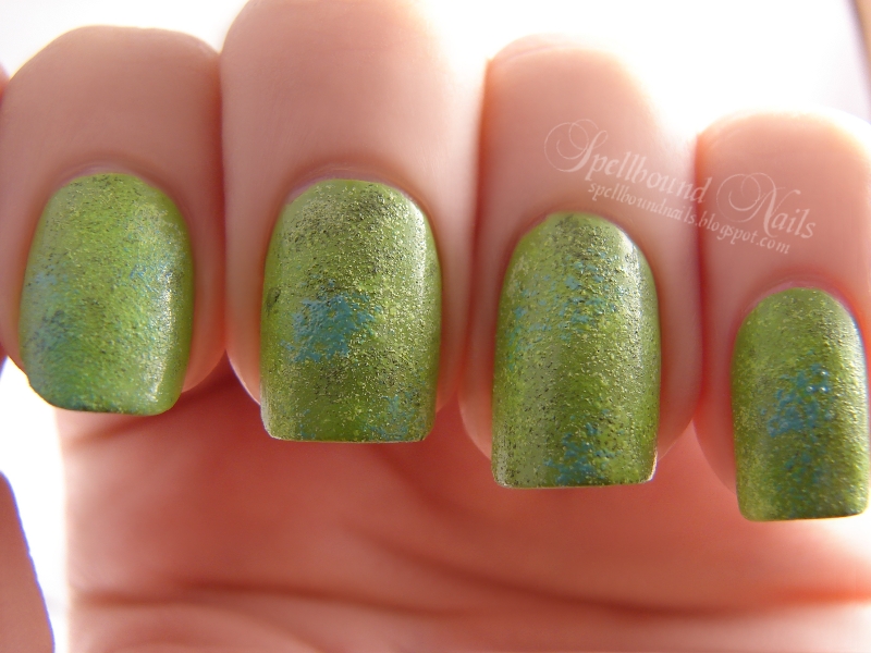
I used Revlon Garden as my base color. I lightened it and darkened it with white and black for the texture. I also added a few dabs of Color Club's neon yellow Yell-Oh! Looking through pictures of iguanas I found a beautiful green iguana that had light blue patches on its skin so I also added some dabs of Wet n Wild I Need a Refresh-Mint over the texturing.
Here is a closer look at the texture. I had a moment of panic upon realizing I had no scale stamps on any of my stamping plates. The one stamp that looked anything like scales was absolutely tiny! So, I settled for Born Pretty Store's m61 stamping plate. I used China Glaze Holly-Day and actually consciously slowed my movements so I wouldn't get the full stamp. A first for me, but I wanted it to look uneven like scales and I also wanted some of the texturing to show through in places.
I wasn't completely happy with the texturing and scales so I added an iguana eye to my index nail hoping to give this mani some life. In this picture, before I removed the design, I decided to see what it looked like with a top coat. The nails lost nearly all the rough texturing I worked so hard to create, but I really like how the eye took on a more realistic quality. Look into it and tell me it doesn't stare back at you!
I is for ... Iguana. Not very unique, but I tried. :)
I used Revlon Garden as my base color. I lightened it and darkened it with white and black for the texture. I also added a few dabs of Color Club's neon yellow Yell-Oh! Looking through pictures of iguanas I found a beautiful green iguana that had light blue patches on its skin so I also added some dabs of Wet n Wild I Need a Refresh-Mint over the texturing.
Here is a closer look at the texture. I had a moment of panic upon realizing I had no scale stamps on any of my stamping plates. The one stamp that looked anything like scales was absolutely tiny! So, I settled for Born Pretty Store's m61 stamping plate. I used China Glaze Holly-Day and actually consciously slowed my movements so I wouldn't get the full stamp. A first for me, but I wanted it to look uneven like scales and I also wanted some of the texturing to show through in places.
I wasn't completely happy with the texturing and scales so I added an iguana eye to my index nail hoping to give this mani some life. In this picture, before I removed the design, I decided to see what it looked like with a top coat. The nails lost nearly all the rough texturing I worked so hard to create, but I really like how the eye took on a more realistic quality. Look into it and tell me it doesn't stare back at you!
Monday, November 5, 2012
H is for ...
Hello again! I'm back. I feel much better for taking a few days off. Sadly, the cold weather is wreaking havoc with my nails. I've had more than a few breaks. Thankfully, only one of them is on my picture taking hand, and I'm happy to say it wasn't a bad break.
Today's post is another in the ABC Challenge. I'm really late posting but after I missed H is for Halloween on Wednesday ... well, I decided to hold off a few more days and do H is for ... Happy Birthday.
Saturday, the 3rd, was my 27th birthday and these are my birthday nails. I used two coats of Sinful Colors Snow Me White as my base color. On my index and pinkie I did birthday balloons via CutePolish. The middle got candles and the ring has a sparkly frosting loaded cupcake. I did it all in pink (Sinful Colors Beautiful Girl) because I'm ultra girly that way. I love pink. ♥
I'll post tomorrow with some pictures of my birthday haul. :)
Today's post is another in the ABC Challenge. I'm really late posting but after I missed H is for Halloween on Wednesday ... well, I decided to hold off a few more days and do H is for ... Happy Birthday.
Saturday, the 3rd, was my 27th birthday and these are my birthday nails. I used two coats of Sinful Colors Snow Me White as my base color. On my index and pinkie I did birthday balloons via CutePolish. The middle got candles and the ring has a sparkly frosting loaded cupcake. I did it all in pink (Sinful Colors Beautiful Girl) because I'm ultra girly that way. I love pink. ♥
I'll post tomorrow with some pictures of my birthday haul. :)
Wednesday, October 24, 2012
G is for ...
The ABC Challenge is up to G today. There were a ton of things I could have done for G, but I decided to go with something morbid and great for Halloween. So, G is for ... Gravestones.
The grey of New York Colors Sidewalkers made for a great base color. Then I darkened it with some black and lightened it with some white to create the speckled look. I purposely left off any top coat in an attempt to keep the very rough, textured look of old gravestones. I added a skull to my ring finger and a sharp lettered RIP to my middle finger. The last step was to use some of my just purchased Recollections Lime flocking powder to create a scummy moss growing on the 'gravestones'.
Subscribe to:
Posts (Atom)